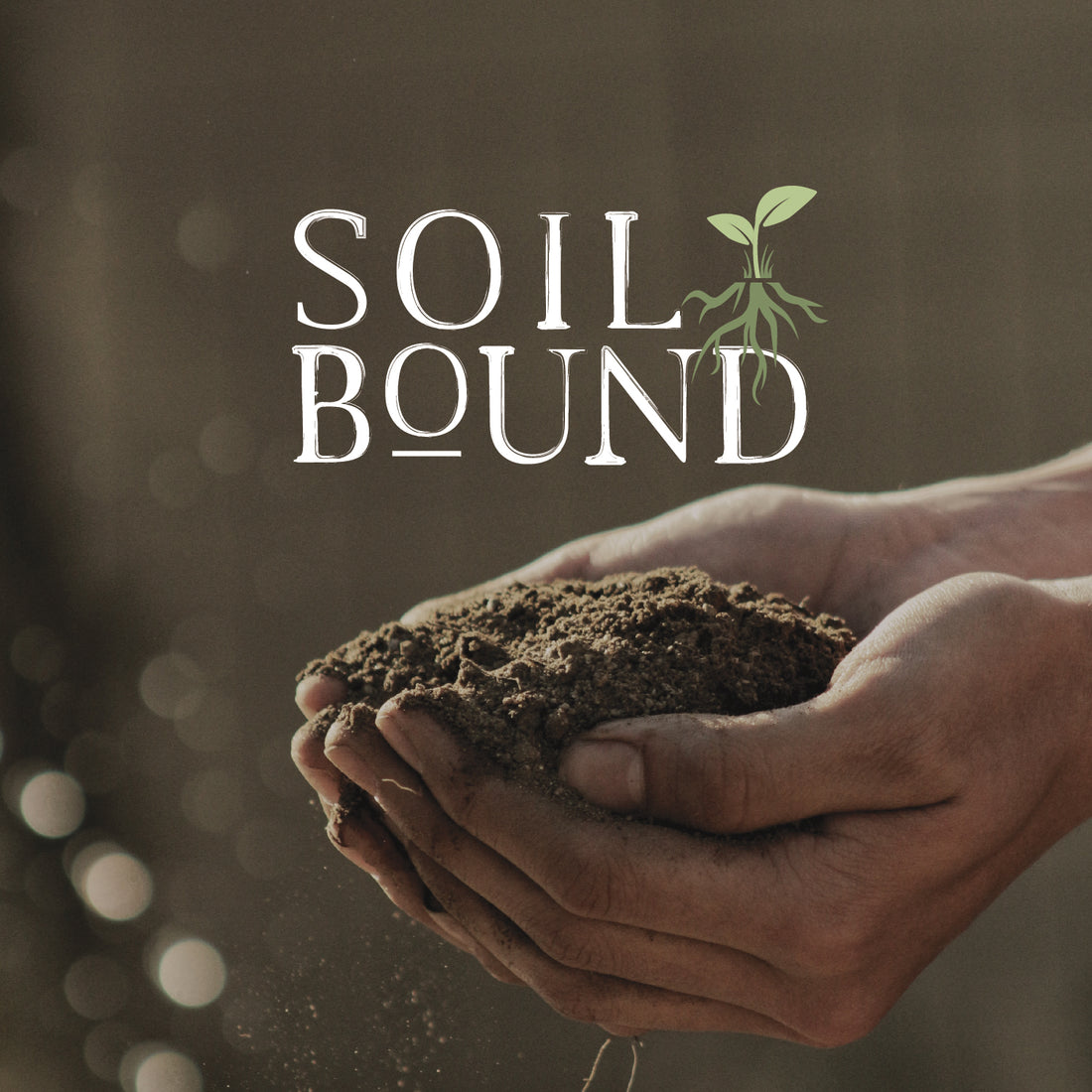
A farming business based out of Catawissa, Pennsylvania - Soil Bound's mission is in their name, returning nutrients to the soil to improve the future of our crops.
Upon getting to know the people behind Soil Bound and their mission, it felt necessary that their branding reflected the organic, wholesome approach they take with their farming. Their name is their mission, so first and foremost we needed to a strong visual representation of their name that will create a lasting impact.
So, what happens next?
We utilized a font that appeared natural and unrefined, yet bold enough to be recognizable across a variety of platforms. While it may appear to be a part of the font, the line underneath the 'o' in bound is actually a visual tie to the importance of returning the nutrients to the soil.
When we finalized the font, we decided to add balance + visual interest to the branding by creating an icon that represents Soil Bound. The plant growing amongst grass + from roots in many ways embodies the process of farming + also the mission behind the brand. With healthy soil, our crops are able to flourish, grow + thrive - all of which is also very true of their brand.
