Now this was a fun one!
We are a design studio built on a love for modern + minimalist design, but when the client is an Inflatables rental company - you have to make the design pop!
Bounce houses have always been a fun addition to childhood parties, but they don't have to apply only to kids - so how do you create a branding that is fun, child-like, but also attracts adults? That was the challenge we tackled head on.
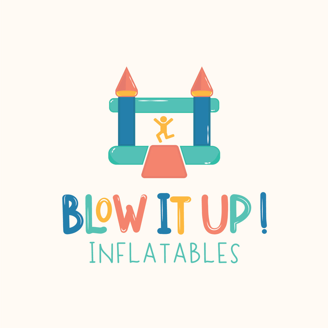
Rather than the cliché primary colors- we wanted to pay homage to them rather than replicate them. In the branding you will see tones of yellow, blue, green, and red, but they are modernized. The refinement of the color palette allows it to see be appealing to kids, but attracts a mature audience as well because it does not scream "kid colors".
Color Palette - Check! What comes next?
A business does not need to include an icon in their branding packages but they are highly useful + adaptable! After talking to the client, we knew with a company whose main product is bounce-houses that had to include one - but within reason. To add some finishing touches, we included white elements to reflect the blown up appearance as well as add some fun dimension to the design. You cannot look at this logo + not focus on the person inside the house, jumping, having fun - which honestly is the whole point.
While this may be a far more colorful branding than the majority of our clients, it stands as one of our absolute favorites!
