
When you've been of service to the community for 60 years, it becomes easier to be overlooked or misunderstood. So what's the solution? Reintroduce your organization to the community through a revised scope, fresh design + branding that honors the past, but embraces the future.
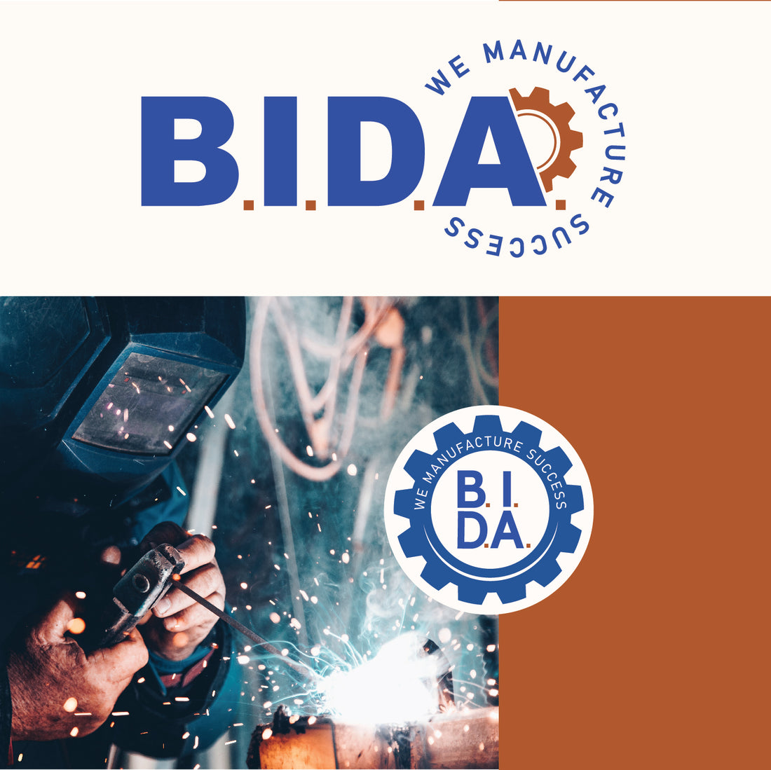
It was clear once we met with the client that maintaining the respect + clientele they have gained over the past 60 years could not be overlooked, but rather - showcased in a new light. In order to showcase the past, while looking towards the future - we continued to use a blue as their main color as it has been for years, but wanted to introduce a rust tone that would represent the various industrial aspects of their brand.
While they have been in the community for 60 years, B.I.D.A. did not have a huge branded presence. Our solution to this was to provide a branding package that allowed them to adapt to a variety of changing platforms, marketing + audiences.
The most exciting addition? The introduction of the cog as an element of their branding. While a cog is industrial in nature, it also represents movement, innovation + progress, all of which is key to the success of B.I.D.A.
B.I.D.A. is "committed to improving the economy of the region through marketing and managing its industrial assets, the retention, expansion, and recruitment of business and industry: and contributing to community revitalization efforts..." Through effort + partnerships, B.I.D.A. is "bettering the quality of life of the citizens of the area!"